Please note: Lab 3 is Due Tuesday, October 27th
Learning Objectives
- How to calculate summary statistics with statcrunch
- How to graph multiple boxplots on a single graph
- How to analyse and interpret boxplots
Occupational Noise Exposure
Every year, approximately 30 million people in the United States are occupationally exposed to hazardous noise. Noise-related hearing loss has been listed as one of the most prevalent occupational health concerns in the United States for more than 25 years. Thousands of workers every year suffer from preventable hearing loss due to high workplace noise levels. Exposure to high levels of noise can cause permanent hearing loss. Loud noise can also create physical and psychological stress, reduce productivity, interfere with communication and concentration, and contribute to workplace accidents and injuries by making it difficult to hear warning signals. (Source: OSHA)How loud is too loud?
Noise is measured in units of sound pressure levels called decibels, named after Alexander Graham Bell, using A-weighted sound levels (dBA). The A-weighted sound levels closely match the perception of loudness by the human ear. Decibels are measured on a logarithmic scale which means that a small change in the number of decibels results in a huge change in the amount of noise and the potential damage to a person's hearing. OSHA sets legal limits on noise exposure in the workplace. These limits are based on a worker's time weighted average over an 8 hour day. With noise, OSHA's permissible exposure limit (PEL) is 90 dBA for all workers for an 8 hour day. The National Institute for Occupational Safety and Health (NIOSH) has recommended that all worker exposures to noise should be controlled below a level equivalent to 85 dBA for eight hours to minimize occupational noise induced hearing loss. (Source: OSHA)The Noisy Workplace
Assume you are the new manager at a cereal factory and have recently heard complaints about noise levels from some of the workers. You charge the quality control department with taking decibel readings at five different areas of the factory at different times of the day and week. The results of the data collection are listed in the table below (and on this spreadsheet). Use boxplots to initially explore the data and make recommendations about which factory areas workers must be provided with protective ear wear. Use NIOSH's recommendation that all worker exposures to noise be controlled below a level equivalent to 85 dBA for eight hours to minimize occupational noise induced hearing loss.| Area 1 | Area 2 | Area 3 | Area 4 | Area 5 |
|---|---|---|---|---|
| 30 | 64 | 100 | 25 | 59 |
| 12 | 75 | 59 | 15 | 63 |
| 35 | 57 | 78 | 30 | 81 |
| 65 | 59 | 97 | 20 | 110 |
| 24 | 23 | 84 | 61 | 65 |
| 59 | 16 | 64 | 56 | 112 |
| 68 | 77 | 53 | 34 | 132 |
| 57 | 78 | 59 | 22 | 145 |
| 82 | 57 | 89 | 24 | 163 |
| 61 | 32 | 88 | 21 | 120 |
| 32 | 52 | 94 | 32 | 84 |
| 45 | 78 | 66 | 52 | 99 |
| 83 | 59 | 57 | 14 | 105 |
| 56 | 55 | 62 | 10 | 68 |
| 44 | 55 | 64 | 33 | 75 |
In order to get full credit for Lab 3, your lab report should be only four pages long and include the following:
- Here is the lab cover sheet. Print this page and answer the questions on it.
- Page 2: This should be a statcrunch graph of all five boxplots on a single graph. Your graph must include a title with your name on it. Your graph must use fences and clearly indicate the location of outliers.
- Page 3: This page should be a printout of the summary statistics (generated from statcrunch) for each of the five areas of the factory.
- Page 4: This page be a typed, short paragraph explaining your recommendations about which factory areas workers must be provided with protective ear wear. Use NIOSH's recommendation that all worker exposures to noise be controlled below a level equivalent to 85 dBA for eight hours to minimize occupational noise induced hearing loss.


The Five-Number Summary and Boxplots
A boxplot can be used to graphically represent the data set. These plots involve five specific values:- The lowest value of the data set (i.e., minimum)
- Q1
- The median
- Q3
- The highest value of the data set (i.e., maximum)
A boxplot (or box-and-whisker plot) is a graph of a data set obtained by drawing a horizontal line from the minimum data value to Q1, drawing a horizontal line from Q3 to the maximum data value, and drawing a box whose vertical sides pass through Q1 and Q3 with a vertical line inside the box passing through the median or Q2.
Boxplot Example
The number of meteorites found in 10 states of the United States is89, 47, 164, 296, 30, 215, 138, 78, 48, 39.
Construct a boxplot for the data.
Solution
Step 1 Arrange the data in order:
30, 39, 47, 48, 78, 89, 138, 164, 215, 296
Step 2 Find the median. There isn't a single data value in the middle of the sorted list, so we take the average of the two values in the middle
median = (78+89)/2 = 83.5
Step 3 Find Q1. 47 is the value in the center of the lower 50% of the data, so Q1 = 47.
30, 39, 47, 48, 78
Step 4 Find Q3. 164 is the value in the center of the top 50% data, so Q3 = 164.
89, 138, 164, 215, 296
Step 5 Draw a scale for the data on the x axis.
Step 6 Located the lowest value, Q1, median, Q3, and the highest value on the scale.
Step 7 Draw a box around Q1 and Q3, draw a vertical line through the median, and connect the upper value and the lower value to the box. See the figure below

Modified Boxplot Example
A modified boxplot (or modified box-and-whisker plot) is a plot that shows the center, spread, and skewness of a data set. It is constructed by drawing a box and two whiskers that use the median, the first quartile, the third quartile, and the smallest and the largest values in the data set between the lower and the upper inner fences.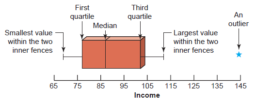 The data is skewed.
EXAMPLE,: The following data are the incomes (in thousands of dollars) for a sample of 12 households.
75 69 84 112 74 104 81 90 94 144 79 98
Construct a modified box-and-whisker plot for these data.
Solution The following five steps are performed to construct a box-and-whisker plot.
Step 1. First, rank the data in increasing order and calculate the values of the median, the first quartile, the third quartile, and the interquartile range. The ranked data are
69 74 75 79 81 84 90 94 98 104 112 144
For these data,
\begin{align} Median &= (84 + 90)/2 = 87\\ Q1 &= (75 + 79)/2 = 77\\ Q3 &= (98 + 104)/2 = 101\\ IQR &= Q3 - Q1 = 101 - 77 = 24 \end{align} Step 2. Find the points that are $1.5 \times IQR$ below Q1 and $1.5 \times IQR$ above Q3. These two points are called the lower and the upper inner fences, respectively. \begin{align} 1.5 \times IQR &= 1.5 \times 24 = 36\\ \text{Lower inner fence } &= Q1 - 36 = 77 - 36= 41\\ \text{Upper inner fence } &= Q3 - 36 = 101 + 36 = 137 \end{align} Step 3. Determine the smallest and the largest values in the given data set within the two inner fences. These two values for our example are as follows: \begin{align} \text{Smallest value within the two inner fences } &=69\\ \text{Largest value within the two inner fences } &= 112 \end{align} Step 4. Draw a horizontal line and mark the income levels on it such that all the values in the given data set are covered. Above the horizontal line, draw a box with its left side at the position of the first quartile and the right side at the position of the third quartile. Inside the box, draw a vertical line at the position of the median. The result of this step is shown in the figure below.
 Step 5. By drawing two lines, join the points of the smallest and the largest values within
the two inner fences to the box. These values are 69 and 112 in this example as listed in
Step 3. The two lines that join the box to these two values are called whiskers. A value
that falls outside the two inner fences is shown by marking an asterisk and is called an outlier.
This completes the box-and-whisker plot, as shown in the figure below.
Step 5. By drawing two lines, join the points of the smallest and the largest values within
the two inner fences to the box. These values are 69 and 112 in this example as listed in
Step 3. The two lines that join the box to these two values are called whiskers. A value
that falls outside the two inner fences is shown by marking an asterisk and is called an outlier.
This completes the box-and-whisker plot, as shown in the figure below.
Information Obtained from a Boxplot
-
- If the median is near the center of the box, the distribution is approximately symmetric.
- If the median falls to the left of the center of the box, the distribution is positively skewed.
- If the median falls to the right of the center, the distribution is negatively skewed.
-
- If the lines/whiskers are about the same length, the distribution is approximately symmetric.
- If the right line is larger than the left line, the distribution is positively skewed.
- If the left line is larger than the right line, the distribution is negatively skewed.
Definitions
EXPLORATORY DATA ANALYSIS the act of analyzing data to determine what information can be obtained by using stem and leaf plots, medians, interquartile ranges, and boxplotsINTERQUARTILE RANGE $Q3−Q1$. The range of the middle 50% of the data
NEGATIVELY SKEWED OR LEFT-SKEWED DISTRIBUTION a distribution in which the majority of the data values fall to the right of the mean
POSITIVELY SKEWED OR RIGHT-SKEWED DISTRIBUTION a distribution in which the majority of the data values fall to the left of the mean
Determining Normality
PEARSON'S INDEX OF SKEWNESS VALUE is a formula used to determine the degree of skewness of a variable. \[ \text{PEARSON'S INDEX OF SKEWNESS VALUE }= \frac{3(\bar{X}-median)}{s} \] (where \( \bar{X} \) is the sample mean and $s$ is the sample standard deviation.- If the index is greater than 1, then the data are positively skewed (skewed right)
- If the index is less than -1, then the data are negatively skewed (skewed left)
- If neither of these conditions is satisfied, then the data is not significantly skewed.
EXAMPLE
A survey of 18 high-technology firms showed the number of days’ inventory they had on hand. Determine if the data are approximately normally distributed.5 29 34 44 45 63 68 74 74 81 88 91 97 98 113 118 151 158
Solution
Step 1 Construct a frequency distribution and draw a histogram for the data.


Step 2 Check for skewness. For these data, $\bar{X}= 79.5$, median = 77.5, and $s = 40.5$. Using Pearson’s index of skewness gives \[ \text{index of skewness} = \frac{3(79.5-77.5)}{40.5} = 0.148 \] In this case, the index of skewness is not greater than 1 or less than -1, so it can be concluded that the distribution is not significantly skewed.
Step 3 Check for outliers. Recall that an outlier is a data value that lies more than 1.5 (IQR) units below Q1 or 1.5 (IQR) units above Q3. In this case, Q1 = 45 and Q3 = 98; hence, IQR = Q3 - Q1 = 98 - 45 = 53. An outlier would be a data value less than 45 - 1.5(53) = -34.5 or a data value larger than 98 + 1.5(53) = 177.5. In this case, there are no outliers.
Since the histogram is approximately bell-shaped, the data are not significantly skewed, and there are no outliers, it can be concluded that the distribution is approximately normally distributed.
EXAMPLE
The data shown consist of the number of games played each year in the career of Baseball Hall of Famer Bill Mazeroski. Determine if the data are approximately normally distributed.81 148 152 135 151 152 159 142 34 162 130 162 163 143 67 112 70
Solution
Step 1 Construct a frequency distribution and draw a histogram for the data.
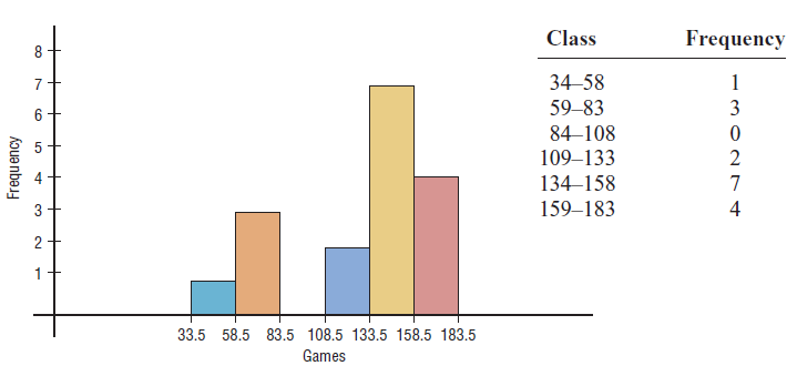 The histogram shows that the frequency distribution is somewhat negatively
skewed.
The histogram shows that the frequency distribution is somewhat negatively
skewed.Step 2 Check for skewness; $\bar{X}$ = 127.24, median = 143, and $s$ = 39.87. \[ \text{index of skewness} = \frac{3(127.24-143)}{39.87} = -1.19 \] Since the index is less than -1, it can be concluded that the distribution is significantly skewed to the left.
Step 3 Check for outliers. In this case, Q1 = 96.5 and Q3 = 155.5. IQR = Q3 - Q1 = 155.5 - 96.5 = 59. Any value less than 96.5 - 1.5(59) = 8 or above 155.5 + 1.5(59) = 244 is considered an outlier. There are no outliers.
In summary, the distribution is somewhat negatively skewed.
LAB RESOURCES
StatCrunch Resources
Other Resources
- Occupational Noise Exposure (OHSA Fact Sheet)
- Lab 3 Data Set
- Your Textbook, pages 102 -- 113
- statistics glossary