Table of Contents
This webpage will teach you how to use your graphing calculator to do the following:
open the calculator's list environment,
clear data from a list,
enter numerical data into a list,
sort data from least to greatest,
construct a frequency distribution from sorted data,
construct a relative frequency distribution,
graph a dotplot,
adjust the graph viewing WINDOW settings,
graph a histogram.
construct a grouped frequency distribution from a histogram
4 Error Messages Fixes
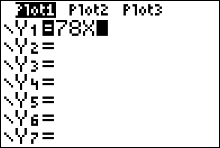
My calculator is having a syntax error!
Press [1] to [QUIT]. If your calculator is throwing a syntax error, you need to turn the other y functions off. Press [y=] and clear out any function definitions with the CLEAR button.You may have to arrow down a bit to find the function definition that needs to be cleared out. Afterwards, press the [GRAPH] button.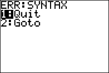
My calculator is having a dim mismatch error!
Press [1] to [QUIT]. If your calculator is throwing a dim mismatch error, you probably have not entered in the same number of y values as x values in your L1 and L2. In other words, there could be a missing or extra entry in one of your lists. Open your list environment ([STAT] [ENTER]) and double check that you have entered in all of the data correctly, or that there is not a missing entry or extra entry in one of your lists. Afterwards, press the [GRAPH] button.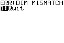
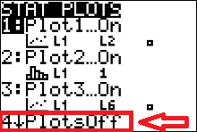
My calculator is having an invalid dim error!
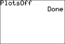
Press [1] to [QUIT]. If your calculator is throwing a invalid dim error, you might have your other statplots turned on, and one of them might be trying to graph a list with empty contents. One way to rectify this error type is to turn all of your statplots off by pressing [2ND][Y=] (for the statplot window) then press [4][ENTER]. You will then have to turn your stat plot 1 back on and then press graph.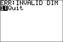
My calculator is having a window range error!
Press [1] to [QUIT] back to the calculator's homescreen (middle graph). Press the [WINDOW] button and change the values in your window settings to the ones given in the rightmost graph above (the default settings).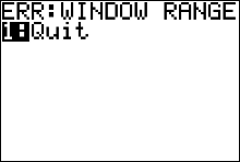

(Warning do not use the subtraction button to mark Xmin as negative ten, instead use the key).
key).
Then press [GRAPH] [ZOOM][9] to zoom in on your STATPLOT graph. In a lot of cases, when this is the error, it is because your Xmin variable is greater than your Xmax variable, or because your Ymin variable is greater than you Ymax variable.
Link to the List of 10 Common Calculator Error Messages
Example Data
Queen honey bees mate shortly after they become adults. During a mating flight, the queen usually takes multiple partners, collecting sperm that she will store and use throughout the rest of her life. The authors of the paper “The Curious Promiscuity of Queen Honey Bees” (Annals of Zoology [2001]: 255-266) studied the behavior of 30 queen honey bees to learn about the length of mating flights and the number of partners a queen takes during a mating flight. Data on number of partners (generated to be consistent with summary values and graphs given in the paper) are shown here.| 12 | 2 | 4 | 6 |
| 6 | 7 | 8 | 7 |
| 8 | 11 | 8 | 3 |
| 5 | 6 | 7 | 10 |
| 1 | 9 | 7 | 6 |
| 9 | 7 | 5 | 4 |
| 7 | 4 | 6 | 7 |
| 8 | 10 |
Entering Data
Opening the Calculator's List Environment
|
We begin by entering in the data from the
in the calculator's list environment. Do this by pressing the  button, button,
|
 |
then press the
 button to 'edit' (open) the calculator's list environment.
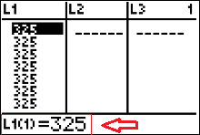
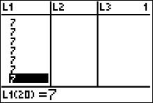
the statement "L1(1)=325" that the red arrow in figure 2 is pointing to is the calculator's way of indicating
that the cursor is in list 1, row 1, and the number in list 1, row 1 is 325. If I press my down arrow key once the cursor moves
down to the second row in L1. Subsequently, the
calculator screens says "L1(2)=325" indicating that the number in list one row two is 325. button to 'edit' (open) the calculator's list environment.
the statement "L1(1)=325" that the red arrow in figure 2 is pointing to is the calculator's way of indicating
that the cursor is in list 1, row 1, and the number in list 1, row 1 is 325. If I press my down arrow key once the cursor moves
down to the second row in L1. Subsequently, the
calculator screens says "L1(2)=325" indicating that the number in list one row two is 325.
Notice I have data in my list 1 that I want to clear out before I enter in the data from the example. |
How to Clear Data From a List
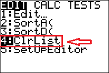 |
If you have data in your list that you want to clear out -- as I have in list 1 of Figure 2 (above) -- then you need to call on the calculator's 'ClrList' command. Press
 to paste the 'ClrList' command to the calculator's homescreen to paste the 'ClrList' command to the calculator's homescreen
|
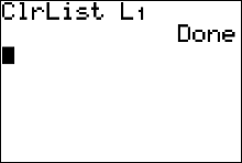 |
followed by
  (for L1), then press . The calculator displays a message saying it's 'done.' (for L1), then press . The calculator displays a message saying it's 'done.'
|
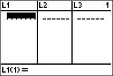 |
Open the list environment to confirm that your lists are clear by pressing
|
What to do if you don't have a L1
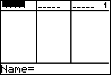 |
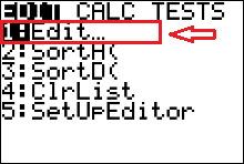
If you accidentally delete a list or L1 or another list is not present, like the screen given in figure 6, to get your lists back you have to use the calculator's 'SetUpEditor' command. |
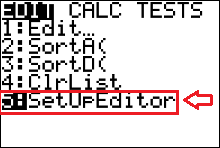 |
Press  to paste the 'SetUpEditor' command to the calculator's homescreen. to paste the 'SetUpEditor' command to the calculator's homescreen.
|
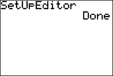 |
then press The calculator displays a message saying it's 'done.'
|
Entering Data
|
|
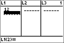
Afterwards, press to edit/open your calculator's list environment,
and check that your lists: L1, L2, L3, etc are displayed.
If your calculator is not displaying L1, L2 and L3 click here for help If your need to clear the contents of list 1 click here for help |
|
|
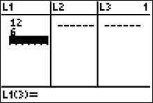
Begin entering in the data from the . Use your arrow keys to make sure your cursor is highlighting the first cell in L1, as shown in Figure 10. |
 |
Then type  to enter 12
(the first number in the dataset) into the List One's row 1 (Figure 11). to enter 12
(the first number in the dataset) into the List One's row 1 (Figure 11).
|
 |
Then type  to enter the second data value. Then enter the rest of the data values into L1 to enter the second data value. Then enter the rest of the data values into L1
|
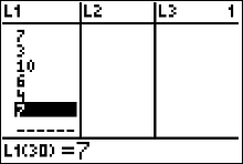 |
Once you get all 30 numbers in L1, use your arrow keys to scroll back through the list and double check that you entered the data in correctly. |
Sorting Data
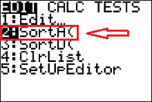 |
To make the dotplot we need to sort the data set from
from least to greatest. We can use the calculator's 'SortA' command.
Do this by pressing .
|
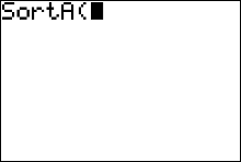 |
This will paste the Sort Ascending command to the calculator's homescreen (Figure 15) |
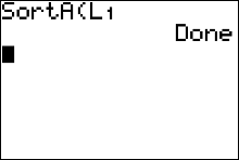 |
afterwards press (for L1) followed by the
button. The calculator displays a message saying it's 'done.'
|
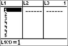 |
Open the list environment by pressing to view the sorted data in list 1.
|
Getting the Frequency Distribution Table
|
|
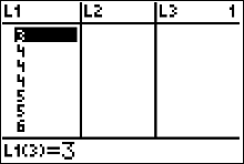
We can easily make a frequency distribution table with the sorted data . From figure 18 (left), we can see the first seven numbers of our sorted list. We see that one queen honey bee had 1 mate, another queen honey bee had 2 mates, another had 3 mates and three queen bees had 4 mates. With this information, we can begin constructing our frequency distribution like this: $$ \begin{array}{|c|c|}\hline Number \ of \ Mates & Frequency\\ \hline 1 & 1 \\ 2 & 1 \\ 3 & 1 \\ 4 & 3 \\ \end{array} $$ |
 |
Since there are two fives we add this information to the next row to our table $$ \begin{array}{|c|c|}\hline Number \ of \ Mates & Frequency\\ \hline 1 & 1 \\ 2 & 1 \\ 3 & 1 \\ 4 & 3 \\ \color{red}5 &\color{red} 2\\ \end{array} $$ |
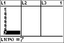 |
Since there are five sixes we add this information to the next row to our table $$ \begin{array}{|c|c|}\hline Number \ of \ Mates & Frequency\\ \hline 1 & 1 \\ 2 & 1 \\ 3 & 1 \\ 4 & 3 \\ 5 & 2\\ \color{red} 6 & \color{red} 5\\ \end{array} $$ |
 |
Since there are seven sevens we add this information to the next row to our table $$ \begin{array}{|c|c|}\hline Number \ of \ Mates & Frequency\\ \hline 1 & 1 \\ 2 & 1 \\ 3 & 1 \\ 4 & 3 \\ 5 & 2\\ 6 & 5\\ \color{red} 7 & \color{red} 7\\ \end{array} $$ |
 |
Continuing in this fashion gives us this completed frequency distribution for the $$ \begin{array}{|c|c|}\hline Number \ of \ Mates & Frequency\\ \hline 1 & 1 \\ 2 & 1 \\ 3 & 1 \\ 4 & 3 \\ 5 & 2\\ 6 & 5\\ 7 & 7\\ 8 & 4 \\ 9 & 2 \\ 10 & 2 \\ 11 & 1 \\ 12 & 1 \\ \hline total & 30 \ queen \ honey \ bees \end{array} $$ |
Getting the Relative Frequency Distribution Table
|
To get the Relative Frequency Distribution (Table), we get each relative (percentage) frequency
by dividing each number in the frequency column by 30, the sample size.
$$
\begin{array}{|c|c|c|}\hline
Number \ of \ Mates & Frequency& Relative Frequency\\ \hline
1 & 1 & 0.033\\
2 & 1 & 0.033 \\
3 & 1 & 0.033 \\
4 & 3 & 0.010 \\
5 & 2 & 0.067\\
6 & 5 & 0.167\\
7 & 7 & 0.233\\
8 & 4 & 0.133 \\
9 & 2 & 0.067\\
10 & 2 & 0.067 \\
11 & 1 & 0.033\\
12 & 1 & 0.033\\ \hline
total & 30 \ queen \ honey \ bees& 0.999 \\
& & (differs \ from \ 1\\
& & due \ to \ rounding)\\
\end{array}
$$
We could write each relative frequency as a percentage by multiplying each relative by 100. Then the first relative frequency would be 3.3%, and so on. |
Dotplot Example
**technical note: the method of using the calculator to graph a dotplot that is presented below is not as quick as loading and then running Roger Palay's dotplot program onto your calculator. Palay's website: http://courses.wccnet.edu/~palay/math160/tiprogs.htm
**technical note: the method presented below can be timeconsuming for a large data set, and a dotplot is not an effective way to summarize a large data set. It might be easier or more useful to obtain the dotplot graph using statistical software like JMP, Minitab, StatCrunch, etc., or use the calculator program mentioned above. If you have a large data set, then a histogram is a more effective way of displaying the data than a dotplot.
( Here is a link to a video showing how to make a dotplot using JMP)
( Here is a link to a video showing how to make comparative dotplots using JMP)
( Here is a link to a video showing how to make a dotplot using StatCrunch)
WHAT TO TO LOOK FOR IN THE DOTPLOT
Dotplots convey information about:
- A representative or typical value in the data set
- The extent to which the data values spread out
- The nature of the distribution of values along the number line
- The presence of unusual values in the data set
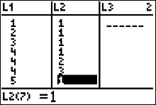 |
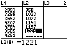
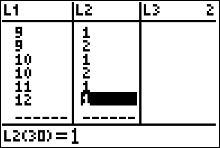
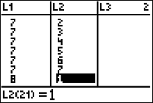
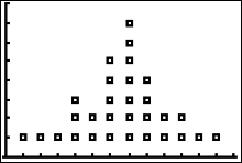
We are going to make the calculator plot an ordered pair, (x,y), for each of the 30 sorted data values from the . The x-value of each point will be the values in L1. To get these points to "stack up," we will enter a y-value into L2 for each number in L1. In figure 23 (left), we are looking at the first seven (x,y) points. Since the numbers 1, 2 and 3 in L1 don't repeat, the y-value assigned to each of those numbers is 1. Also notice that in L1, the number 4 occurs 3 times, so the y-values for those numbers are 1, 2 and 3, respectively. If there had been a fourth 4 in L1 then it's y-value in L2 would be 4. |
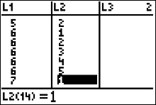 |
The next 7 sorted data values are listed in list 1 of Figure 19 (left). The 5 in list 1 is the second 5 in the sorted data, so its y-value in L2 is 2. Notice that the number 6 in L1 occurs 5 times, hence the y-values in L2 for those five sixes are the natural numbers 1 through 5. |
 |
The next 7 sorted data values are listed in list 1 of Figure 25 (left) along with their y-values in L2. |
 |
The next 7 sorted data values are listed in list 1 of Figure 26 (left) along with their y-values in L2. |
|
|
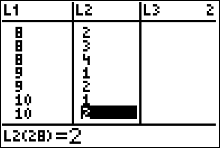
The last 6 sorted data values are listed in list 1 of Figure 27 (left) along with their y-values in L2. |
Adjusting the Viewing Window
 |
Before trying to graph the dotplot or any statistics graph on the calculator, it's not a bad idea to change your WINDOW settings to values appropriate for your graph.
The viewing window is the part of the coordinate plane that will be visible on your graphing calculator screen.
Remember that you are only seeing a "portion" of an entire graph in your viewing window.
If you don't know what values are appropriate,
then you could start with the default values.
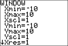
The default values are Xmin =-10, Xmax =10, Ymin =-10, and Ymax = 10.
|
To change the values in the WINDOW
| |
Meaning of the numbers in your viewing window
| |
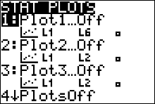 |
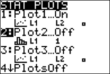
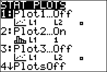
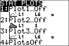
To graph the dotplot, or any statistics graph, we need to access the 'STATPLOT' feature of the calculator. Press
 and you will see a window similar to figure 29 (left) and you will see a window similar to figure 29 (left)
|
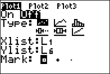 |
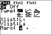
Press or to access the settings window for'Plot 1' (figure 30).
Right now (figure 30), the plot 1 is turned 'OFF'. Use your arrow keys
to move your cursor until it is highlighting the word 'ON' then press
|
 |
Use your down arrow to move your cursor to where it is highlighting the first graph 'TYPE' then press .
The next thing to do is press your down arrow to get to 'XLIST'. Make sure your 'XLIST' is set to L1, and set your 'YLIST' to L2. Use your down arrows to access your 'XLIST' and 'YLIST' settings. Remember
if you need to type L1 then you press and if you need to type L2 then you press
|
 |
Now press 
What to do if your calculator displayed an error message instead of drawing the graph. |
 |
Now press   to access the calculator's ZOOMSTAT command, which tells the WINDOW to adjust its
settings by showing the entire statistics Plot 1 (in this case our dotplot)
to access the calculator's ZOOMSTAT command, which tells the WINDOW to adjust its
settings by showing the entire statistics Plot 1 (in this case our dotplot)
|
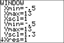 |
Press  and change the settings to the ones given in Figure 34 (left) to get a better scaled graph. and change the settings to the ones given in Figure 34 (left) to get a better scaled graph.
|
 |
Press to see the result of making the window changes.
The graph, using computer software is given below this.
|
 [to QUIT] to exit the WINDOW menu.
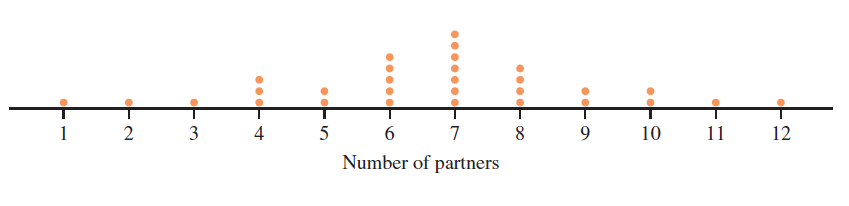
( Here is a link to a video showing how to make a histogram using JMP)
( Here is a link to a video showing how to make a histogram from a frequency table using JMP)
( Here is a link to a video showing how to make comparative histograms with JMP)
( Here is a link to a video showing how to make a histogram in StatCrunch)
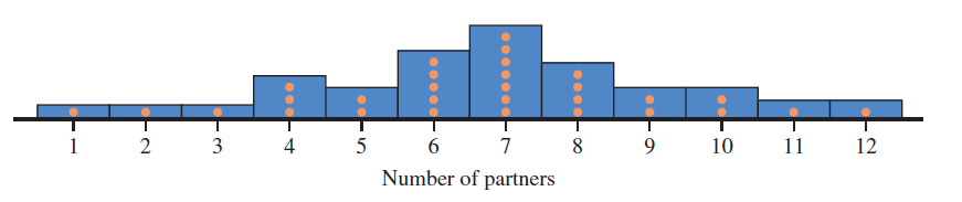
WHAT TO TO LOOK FOR IN THE HISTOGRAM
- The location of the center or typical value
- The extent of spread or variability
- The general shape of the data
- The location and number of peaks in the data
- The presence of gaps and outliers
Histogram Example
 |
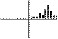
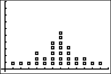
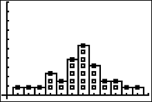
We can graph a histogram over our dotplot as in the figure directly above
from the
. Press
to access the STATPLOT menu, and press for the PLOT 2 settings window.
|
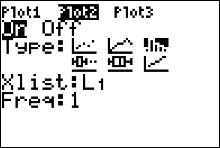 |
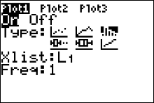
Make sure your Plot 2 is highlighted/selected at the top of the screen (Figure 37). Turn the plot on by using your arrow keys to highlight the word ON then press
.
Now select the histogram graph type: press your down arrow and then your right arrow twice. The cursor should be highlighting the histogram
graph as it is in figure 37 (left). Then press to select the histogram graph type. Arrow down and
make sure your Xlist variable is pointing to L1, where the data set is. Set your Freq variable to 1.
|
 |
Press
What to do if your calculator displayed an error message instead of drawing the graph. |
 |
You can turn Plot 1 Off by pressing
to select the settings window for Plot 1.
Then use your arrow keys to
move your cursor so that it is highlighting the word OFF, then press
|
 |
Afterwards, press to get the histogram by itself.
|
How to Get a Frequency Distribution from the Histogram
EXAMPLE
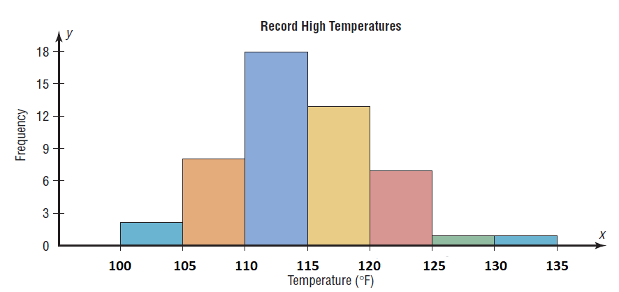
These data represent the record high temperatures in degrees Fahrenheit for each of the 50 states. Construct a grouped frequency distribution for the data using the following class intervals:100 to < 105
105 to < 110, etc. $$ \begin{array}{cccccccccc} 112 & 100 & 127 & 120 & 134 & 118 & 105 & 110 & 109 & 112\\ 110 & 118 & 117 & 116 & 118 & 122 & 114 & 114 & 105 & 109\\ 107 & 112 & 114 & 115 & 118 & 117 & 118 & 122 & 106 & 110\\ 116 & 108 & 110 & 121 & 113 & 120 & 119 & 111 & 104 & 111\\ 120 & 113 & 120 & 117 & 105 & 110 & 118 & 112 & 114 & 114\\ \end{array} $$
 |
Begin the problem by entering the data into your calculator's L1 (list 1).
Figure 41: A dotplot of the data using Roger Palay's dotplot program. (http://courses.wccnet.edu/~palay/math160/tiprogs.htm) |
 |
Press to access your STATPLOT window(figure 42), then press
or to open the Plot 1 settings window. (figure 43)
|
 |
In order to turn your Plot 1 on, you must use your arrow key to move your cursor to highlight the word ON then press
|
 |
The next step is to select the
histogram graph type. Press the down arrow, then press the right arrow twice. Afterwards, your cursor should be highlighting
the histogram icon. Press
to select the hystogram type. Press your down arrow to access your XLIST variable. Make sure your XLIST variable is set to L1. Press
for L1. Also make sure your FREQ variable is set to 1
|
 |
Then press
(zoom 9 accesses your calculator's ZOOMSTAT command which should zoom in
on the portion of the coordinate plane where the graph is located)
What to do if your calculator displayed an error message instead of drawing the graph. |
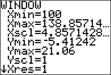 |
When you press the button you can see the values of the window variables were changed by
the ZOOMSTAT command.
|
 |
If you change your 'Xscl' variable to 1 then press
|
 |
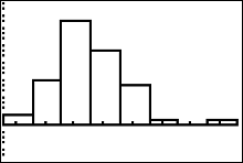
you will see a histogram where every number from xmin = 100 to xmax = 138
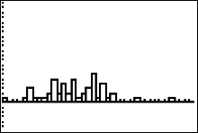
will have a histogram bar. This is because Xscl = 1 sets the histogram bar width to 1.
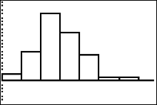
This image is identical to the dotplot in figure 41 |
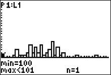 |
If you press the trace key you can see your cursor on top of the first histogram bar corresponding to 100 along the x-axis. The message 'n=1' means that the number 100 degrees occured 1 time in the data set. |
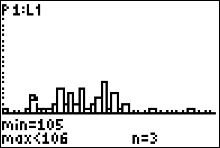 |
If you press your right arrow repeatedly your cursor will go to the next histogram bar and tell you what the frequency (bar height) of that number is. In figure 50, you can tell that the number 105 degrees occurred 3 times in the data set. Keep pressing the right arrow and in this way you can find the frequency of each number in the sample. We will take this sort of approach when we answer the question posed in the |
 |
To make the frequency table for our we begin writing our table like this: $$ \begin{array}{|c|c|}\hline Record \ Temperatures & Frequency\\ \hline 100 \ to < 105 & \\ 105 \ to < 110 & \\ 110 \ to < 115 & \\ 115 \ to < 120 & \\ \end{array} $$ and so on. To find the correct frequencies for each interval of temperatures in the table, we need to get the correct histogram graph first, and then use our trace key like before. |
 |
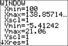
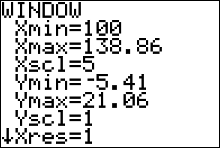
Press the button. Make sure that your XMIN variable is set to 100,
the first number in the first interval class
"100 to < 105". Then set your XSCL variable to 5 and press
This should give you the same image as Figure 52
|
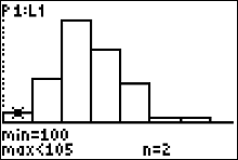 |
Press the  button. You can see the cursor on top of the first histogram bar which the calculator says
corresponds to the first interval class
"100 to < 105". Since the figure indicates 'n=2' the frequency of the first class is 2 and our table now looks like this
$$ \begin{array}{|c|c|}\hline
Record \ Temperatures & Frequency\\ \hline
100 \ to < 105 & \color{red}2 \\
105 \ to < 110 & \\
110 \ to < 115 & \\
115 \ to < 120 &
\end{array}
$$ button. You can see the cursor on top of the first histogram bar which the calculator says
corresponds to the first interval class
"100 to < 105". Since the figure indicates 'n=2' the frequency of the first class is 2 and our table now looks like this
$$ \begin{array}{|c|c|}\hline
Record \ Temperatures & Frequency\\ \hline
100 \ to < 105 & \color{red}2 \\
105 \ to < 110 & \\
110 \ to < 115 & \\
115 \ to < 120 &
\end{array}
$$
|
 |
Press the right arrow button. You can see the cursor on top of the 2nd histogram bar which the calculator says corresponds to the second interval class "105 to < 110". Since the figure indicates 'n=8' the frequency of the 2nd class is 8 and our table now looks like this $$ \begin{array}{|c|c|}\hline Record \ Temperatures & Frequency\\ \hline 100 \ to < 105 & 2 \\ 105 \ to < 110 & \color{red}8 \\ 110 \ to < 115 & \\ 115 \ to < 120 & \\ \end{array} $$ |
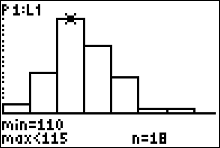 |
Press the right arrow button. You can see the cursor on top of the 3nd histogram bar which the calculator says corresponds to the 3rd interval class "110 to < 115". Since the figure indicates 'n=18' the frequency of the 3rd class is 18 and our table now looks like this $$ \begin{array}{|c|c|}\hline Record \ Temperatures & Frequency\\ \hline 100 \ to < 105 & 2 \\ 105 \ to < 110 & 8 \\ 110 \ to < 115 & \color{red}{18} \\ 115 \ to < 120 & \\ \end{array} $$ |
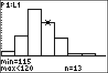 |
Press the right arrow button. You can see the cursor on top of the 4th histogram bar which the calculator says corresponds to the 4th interval class "115 to < 120". Since the figure indicates 'n=13' the frequency of the 4th class is 13 and our table now looks like this $$ \begin{array}{|c|c|}\hline Record \ Temperatures & Frequency\\ \hline 100 \ to < 105 & 2 \\ 105 \ to < 110 & 8 \\ 110 \ to < 115 & 18 \\ 115 \ to < 120 & \color{red}{13}\\ \end{array} $$ |
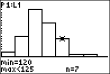 |
Press the right arrow button. You can see the cursor on top of the 5th histogram bar which the calculator says corresponds to the 5th interval class "120 to < 125". Since the figure indicates 'n=7' the frequency of the 5th class is 7 and our table now looks like this $$ \begin{array}{|c|c|}\hline Record \ Temperatures & Frequency\\ \hline 100 \ to < 105 & 2 \\ 105 \ to < 110 & 8 \\ 110 \ to < 115 & 18 \\ 115 \ to < 120 & 13\\ 120 \ to < 125 & \color{red}{7}\\ \end{array} $$ |
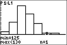 |
Press the right arrow button. You can see the cursor on top of the 6th histogram bar which the calculator says corresponds to the 6th interval class "125 to < 130". Since the figure indicates 'n=1' the frequency of the 6th class is 1 and our table now looks like this $$ \begin{array}{|c|c|}\hline Record \ Temperatures & Frequency\\ \hline 100 \ to < 105 & 2 \\ 105 \ to < 110 & 8 \\ 110 \ to < 115 & 18 \\ 115 \ to < 120 & 13\\ 120 \ to < 125 & {7}\\ 125 \ to < 130 & \color{red}{1}\\ \end{array} $$ |
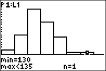 |
Press the right arrow button. You can see the cursor on top of the 7th histogram bar which the calculator says
corresponds to the 7th interval class
"130 to < 135". Since the figure indicates 'n=1' the frequency of the 7th class is 1 and our table now looks like this
$$ \begin{array}{|c|c|}\hline
Record \ Temperatures & Frequency\\ \hline
100 \ to < 105 & 2 \\
105 \ to < 110 & 8 \\
110 \ to < 115 & 18 \\
115 \ to < 120 & 13\\
120 \ to < 125 & {7}\\
125 \ to < 130 & 1\\
130 \ to < 135 & \color{red}{1}\\ \hline
Total & 50 \ temperatures
\end{array}
$$
There are no more histogram bars, for if there were, we would have seen them when we pressed [ZOOM][9] (for ZOOMSTAT). Another indication
that there are no more histogram bars is the fact that all the frequency numbers in the table add up to 50, the same number of measurements in the
data set. Therefore the completed Frequency Distribution is listed above.
If we wanted to get a relative frequency distribution, then we simply need to add on a third column to our table and list each relative frequency. Each relative frequency is found by dividing the frequency of each class by 50, the sample size. |
| The relative frequency distribution looks like this: $$ \begin{array}{|c|c|c}\hline Record \ Temperatures & Frequency& Relative Frequency\\ \hline 100 \ to < 105 & 2 & 0.04 \\ 105 \ to < 110 & 8 & 0.16 \\ 110 \ to < 115 & 18 & 0.36 \\ 115 \ to < 120 & 13 & 0.26 \\ 120 \ to < 125 & {7} & 0.14 \\ 125 \ to < 130 & 1 & 0.02 \\ 130 \ to < 135 & {1} & 0.04 \\\hline Total & 50 \ temperatures & 1 (100\%) \end{array} $$ We can write relative frequencies as decimals or percents. For example, the first relative frequency is 4%, the second is 16%, the third is 36%, and so on. |